
How We Built a Complete Visual Identity for a New Artisan Food Brand in London
When Giuliana reached out, she had everything a great product needs, and nothing a new market requires yet.
Giuliana's chocolate brand was already established in Brazil with a loyal customer base, a clear aesthetic, a point of view about quality and experience that extended well beyond the product itself. But she was starting afresh in London - she had no website, no social media presence and no imagery. Just the chocolates, her story, and an ambition to launch internationally.
That's the most high-stakes moment in a food brand's life. The photography she needed wasn't a "nice-to-have" for her business... it was the entire first impression.
The Brief
Giuliana's brand has a distinctive personality: the chocolates are all beautifully handmade, gift-led, and designed as an experience rather than just a purchase. One of the most distinctive touches that she had at the time of launch was a branded Spotify playlist, accessible via a QR code included with every delivery, so customers could listen to curated music while they eat. That playful, thoughtful detail said everything about what the visual identity needed to feel like.
Her imagery needs were specific:
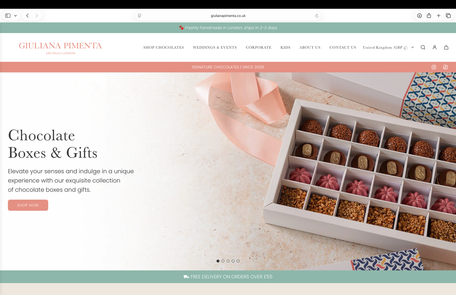
- Website banners: landscape shots with negative space on the left for overlaid text, the kind of images that become the face of a brand homepage.
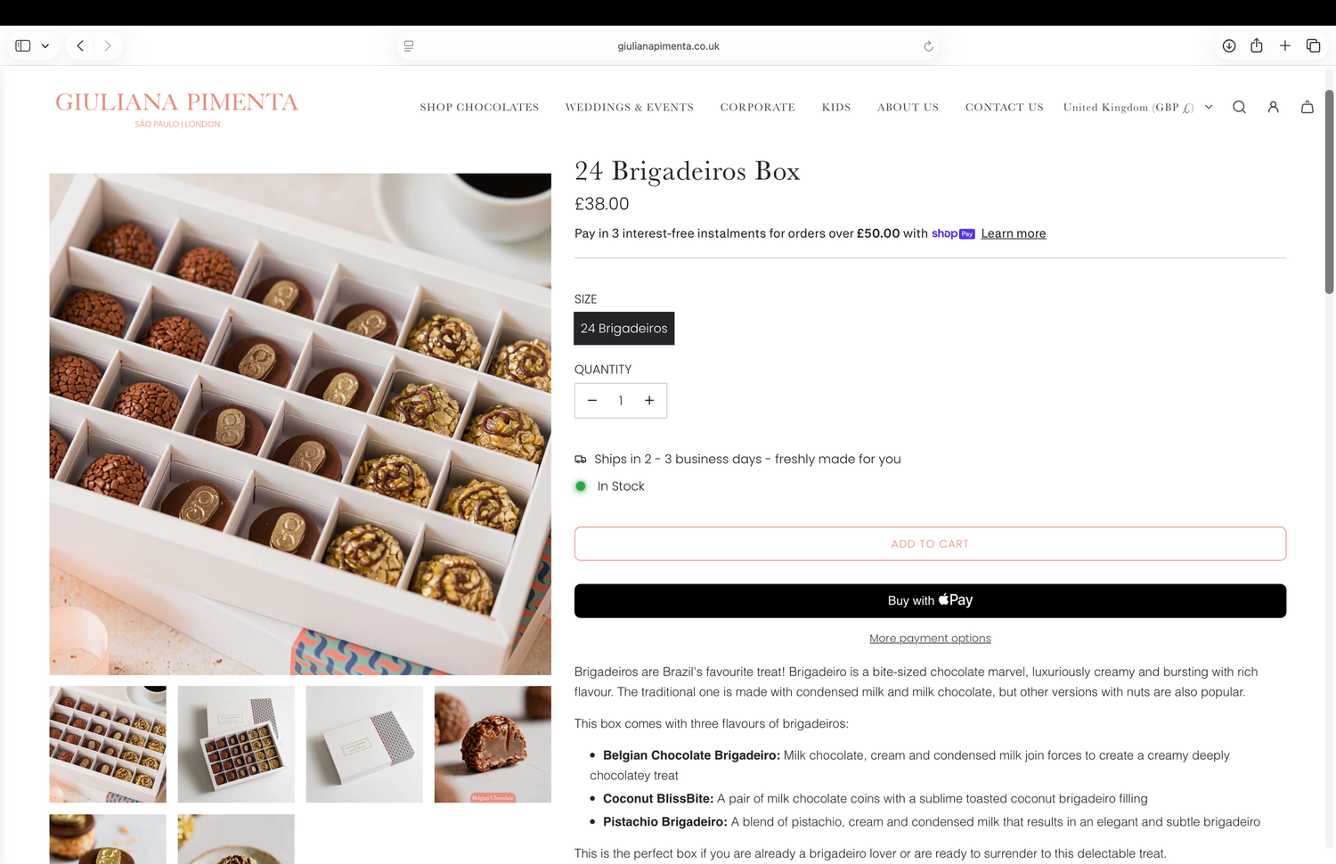
- Webshop images: clean square shots of every box configuration (from 6 to 24 chocolates), both open and closed, giving customers a clear view of every product option.
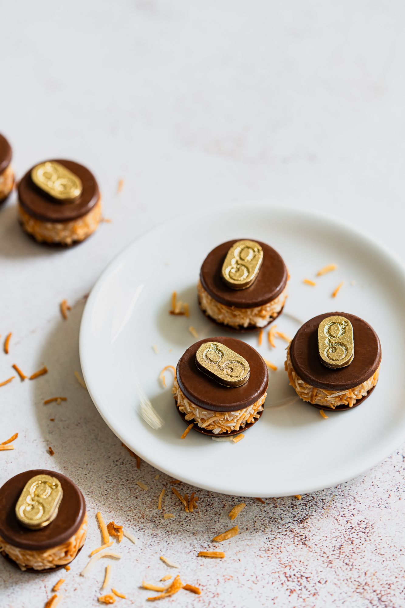
- Flavour communication: macro shots of each individual chocolate, showing texture, finish, and detail at close range.
- The music element: lifestyle shots of the boxes being enjoyed with the Spotify playlist open on a phone, bringing the full brand experience into frame.
- Overall aesthetic: light, bright, and refined, matching the visual identity she had already built for the brand in Brazil.


Before the Shoot: Getting the Foundation Right
For a launch shoot where imagery needs to serve multiple platforms simultaneously, carry a specific brand language, and be ready to use from day one, the pre-production stage is crucial.
Because Giuliana's brand is light and bright, I built the entire backdrop and prop selection around that from the start. Before shoot day, I put together a document listing every backdrop and prop I planned to use, with screenshots showing each one styled and in context. I highlighted the options I felt would work best for her brand specifically, and sent it across for her approval before we began.
This step matters more than most people realise. It means the client can see the direction before a single image is taken, flag anything that doesn't feel right, and go into shoot day with confidence rather than uncertainty. For Giuliana, who was trusting me with her product launch without being able to attend the shoot in person, this stage was particularly important.
Giuliana arrived at shoot day exceptionally well prepared and I can't overstate how much of a difference that made. I'd expected to receive empty boxes in each configuration alongside a bulk of assorted chocolates to package up myself, one by one, as I worked through the shot list. What actually arrived (delivered by her husband directly to my studio) was every single box already made up: each size, each flavour combination, each configuration she sells ready to shoot. She'd also printed out a detailed document listing every configuration and flavour, complete with flavour cue notes. The ingredients I needed for styling, like chocolate chips, desiccated coconut, candied orange peel, were included in the delivery too, individually packaged and labelled for each flavour. It was one of the most organised client deliveries I've ever received, and it allowed me to move through the shot list efficiently and stay completely focused on the creative work rather than logistics. A shoot runs on preparation from both sides, and Giuliana absolutely brought hers!
On Shoot Day: Keeping Communication Open
Because Giuliana wasn't present at the studio, I sent her WhatsApp screenshots of the first images as I worked through the opening setups, so she could see the direction, the light, and the styling before the day was fully underway. She loved what she saw. That early reassurance gave us both the confidence to keep going and meant she wasn't left waiting until delivery to find out whether the shoot had gone the way she imagined.
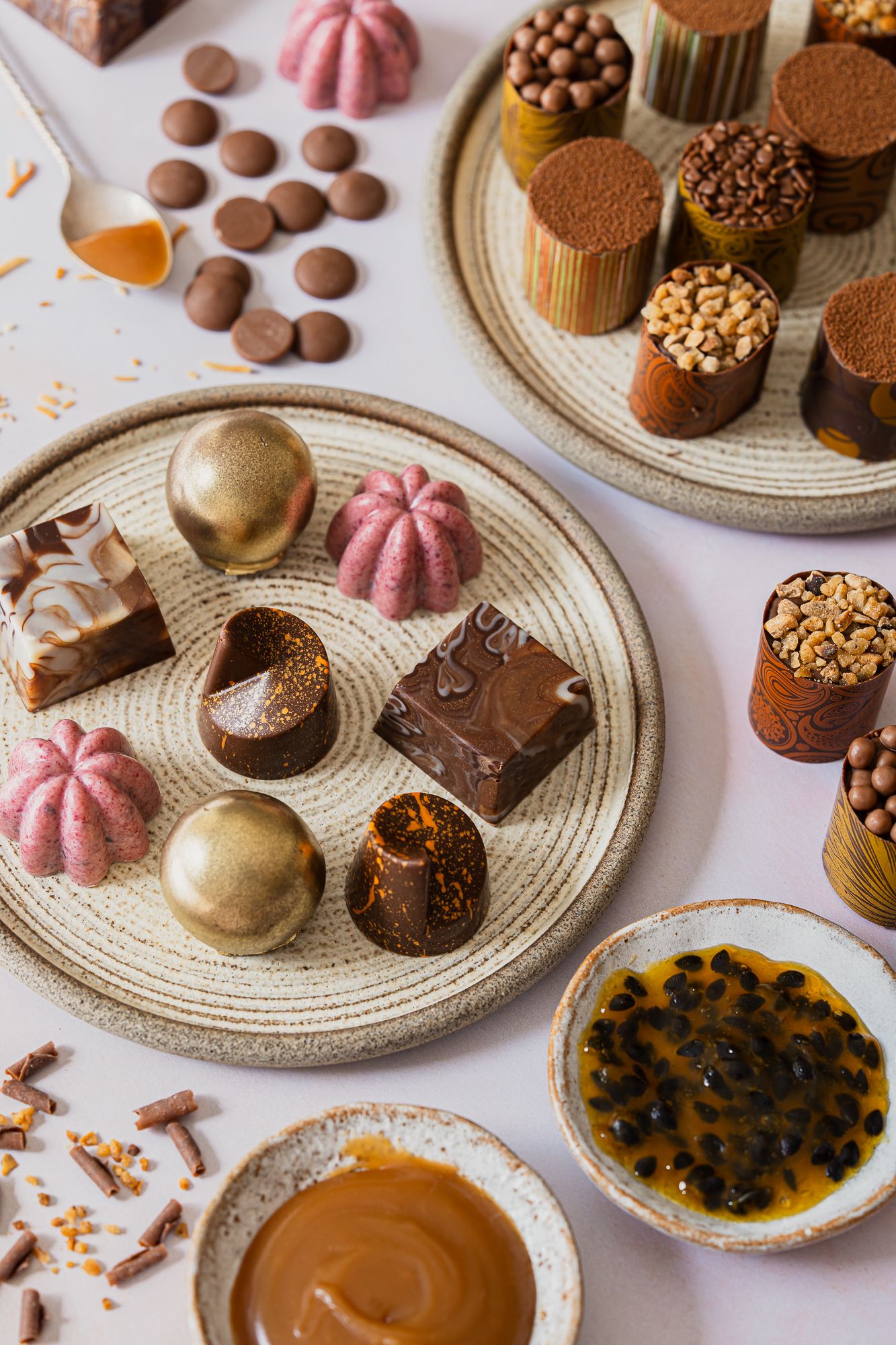
From there I worked through the full shot list: every box size open and closed, macro shots of each chocolate flavour, compositions of chocolates showing both single-flavour arrangements and the combinations that come inside the mixed boxes, and the lifestyle shots incorporating the phone and playlist element.
By the end of the production, Giuliana had a complete gallery. Not a collection of beautiful images she'd need to figure out how to use, but a set of purposeful assets mapped directly to her website, webshop, and social media from the moment she launched.


The Edit: Where Consistency Becomes a Brand Asset
The editing stage is where a collection of good images becomes a coherent visual identity. Every image in Giuliana's gallery went through the same process: colour temperature balanced, lighting consistent across the full set, colour grading matched from the first shot to the last. For an e-commerce brand especially, this consistency matters. When a customer moves through a webshop, every product image needs to feel like it belongs to the same world.
I also retouched each chocolate individually to remove blemishes, marks and surface imperfections so the product looks its absolute best for customer-facing platforms. In food photography for direct-to-consumer brands, this isn't just an aesthetic choice. The image a customer sees before they buy sets the standard they're expecting. It needs to be the best, most accurate version of your product.
The Result
Giuliana launched her London brand with a full suite of imagery across her website, webshop, and Instagram - images that communicated her brand's personality, her product range, and the care that goes into everything she makes.
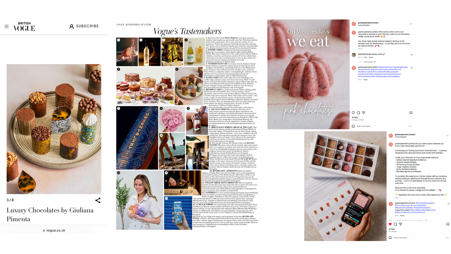
The reach of the imagery went further still: Giuliana's product, photographed in one of the images from our shoot, was featured in British Vogue. For a brand that had launched in the UK just months earlier, that kind of placement, and the visual credibility needed to earn it, says everything about what the right photography can open up!
In her words:
"Linda's work has elevated our brand's positioning, making it clear at first glance that we are all about quality, elegance, and attention to detail. The photos speak for themselves — when people see them, they immediately understand what makes our products special. This has opened so many doors for us, helping us establish our presence and grow our business in a new market."
On what the imagery actually does for the business:
"In the world of food, images can make or break a product. Linda's photos have the power to generate desire — they make people want to taste the chocolates before they've even read a word about them. This has been a game-changer for us, especially as an e-commerce brand. Her work doesn't just showcase our products; it tells a story, creates an experience, and connects with our audience in a way that words alone never could."
Ready to Launch?
If you're building a food brand from the ground up and need a visual identity that earns trust from day one, I'd love to help!
Get in touch to talk about your launch shoot.